Why Your Portfolio’s Look Matters (More Than You Think)
Let’s face it, we’ve all been there. You’re scrolling through someone’s portfolio, and it looks like it was designed by a toddler with a crayon. Yikes. You click away faster than you can say unprofessional. Now, flip that scenario. You land on a sleek, eye-catching portfolio that screams I know my stuff! Which one would you hire?
Here’s the thing: your work might be top-notch, but if your portfolio looks like it’s stuck in the 90s, you’re already fighting an uphill battle. So, let’s dive into how to make your portfolio not just good, but scroll-stopping good.
The Building Blocks of a Killer Portfolio
1. Keep It Simple, Smartypants
Ever been to a website that felt like a digital hoarder’s paradise? Yeah, don’t do that. White space is your friend. It’s like the breath between sentences – it gives your work room to shine. Think of it as the difference between a cluttered desk and a zen workspace. Which one makes you want to create?
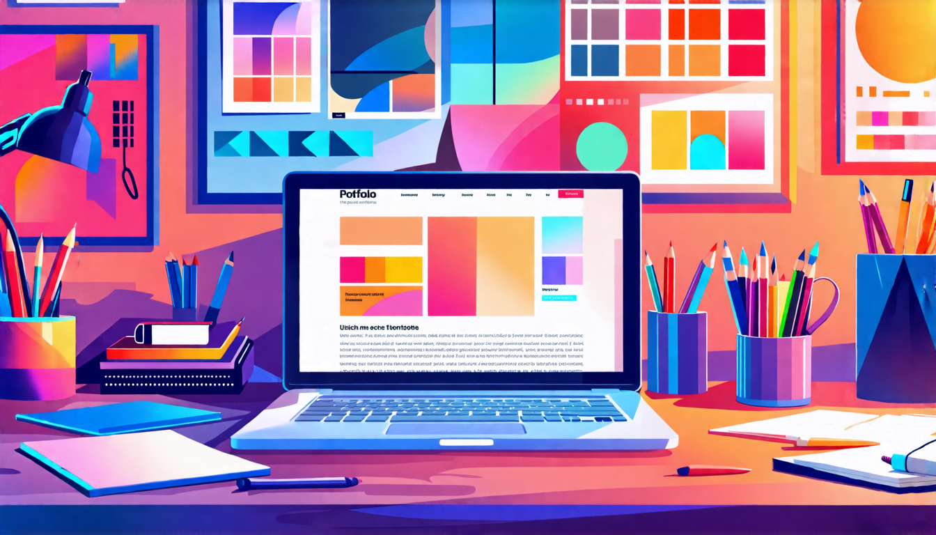
2. Colors: Don’t Go Crazy
Remember that time you mixed all the paint colors as a kid and ended up with that weird brown sludge? Same principle applies here. Stick to a simple color palette – 2 to 3 colors max. It’s like putting together an outfit. You want to look put-together, not like you got dressed in the dark.
3. Typography: More Than Just Pretty Letters
Fonts are like seasoning in cooking. The right amount enhances everything, too much and you’ve ruined the dish. Choose 1-2 fonts that complement each other. And for the love of all things holy, make sure they’re readable. No one wants to squint at your screen like they’re trying to decipher ancient hieroglyphics.
Showcase Your Work Like a Boss
1. Quality Over Quantity, Always
You know that friend who overshares on social media? Don’t be the portfolio equivalent. Curate your best work. It’s better to have 5 knockout projects than 20 mediocre ones. Think of it as your greatest hits album, not your entire discography.
2. Tell a Story
Each project should have a mini-story. What was the challenge? How did you tackle it? What was the outcome? It’s like explaining to your grandma what you do for a living – make it simple, engaging, and leave out the jargon.
3. Make It Easy to Navigate
If your portfolio is harder to navigate than a corn maze, you’re doing it wrong. Clear categories, easy-to-find contact info, and a logical flow. Think of it as laying out a welcome mat for potential clients or employers.
The Secret Sauce: Personality
Here’s where most people mess up. They create a portfolio that looks like everyone else’s. Snooze fest. Inject some personality into that bad boy. Use your unique voice. Share a quirky fact about yourself. It’s like seasoning your portfolio with a dash of you-ness.
I once saw a designer’s portfolio that had a Dad Jokes section. Was it professional? Not really. Did it make me remember him? You bet your sweet bippy it did.
Mobile-Friendly or Bust
Picture this: A potential client is scrolling through portfolios on their phone while waiting for coffee. They hit yours, and it’s a hot mess on mobile. Guess what? You just lost a gig to someone who bothered to make their site responsive. Don’t be that person. Make sure your portfolio looks good on everything from a 27-inch monitor to a tiny phone screen.
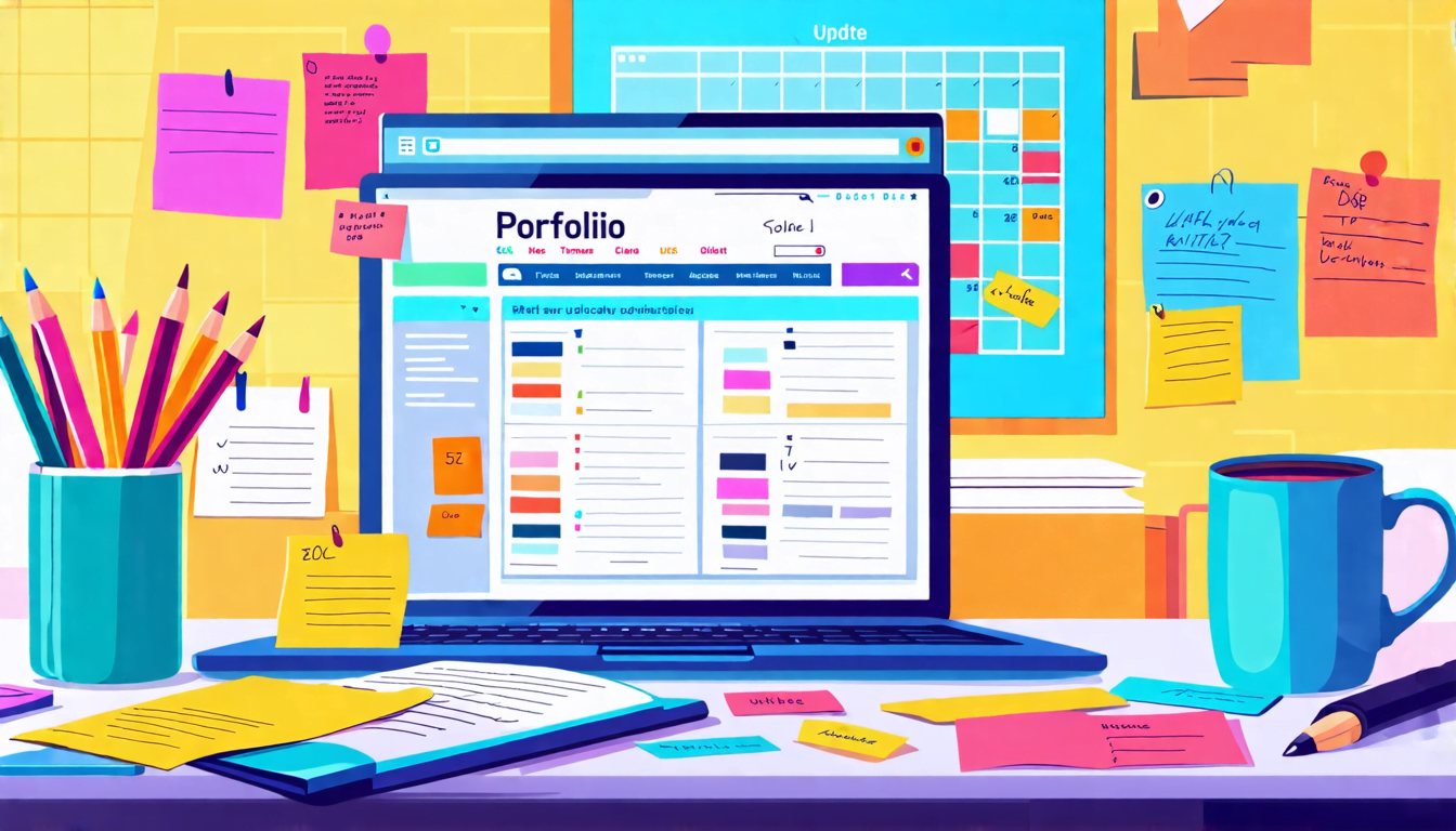
The Final Touch: Keep It Fresh
Your portfolio is not a set it and forget it deal. It’s more like a garden – it needs regular tending. Update it with your latest work. Tweak the design. Keep it current. A stale portfolio is about as appealing as week-old sushi.
Remember, your portfolio is often your first impression. Make it count. Make it so good that people can’t help but want to work with you. Now go forth and create something awesome. Your future clients (and your bank account) will thank you.