Why Should You Care About Web Typography?
Ever landed on a website and felt your eyes glaze over? You’re not alone. Bad typography can make even the most interesting content feel like a chore to read. But here’s the thing: good typography isn’t just about making things pretty. It’s about making your message stick.
Let’s dive into the world of web typography without getting too nerdy about it. Think of it as choosing the right outfit for your words – you want them to look good and feel comfortable, right?
The Building Blocks: Fonts and Typefaces
First things first: fonts and typefaces. They’re like the DNA of your text. Choose wisely, and your content will sing. Choose poorly, and… well, let’s just say it won’t be music to anyone’s eyes.
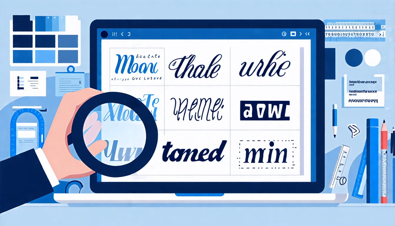
Serif vs. Sans-Serif: The Classic Showdown
You’ve probably heard these terms thrown around, but what do they actually mean?
- Serif: These are the fonts with little feet. Think Times New Roman. They’re like the formal wear of fonts.
- Sans-serif: No feet here. Clean and modern, like Arial or Helvetica. It’s the casual Friday of typography.
Here’s a pro tip: mix and match. Use a serif for headlines and a sans-serif for body text. It’s like pairing wine with cheese – when done right, it’s *chef’s kiss*.
Size Matters (But It’s Not Everything)
Remember when your grandma would squint at her phone and say, I can’t read this!? Yeah, font size is crucial. But it’s not just about making everything bigger.
The Golden Rule of Font Sizing
- Body text: Aim for 16-18px. It’s the sweet spot for readability.
- Headlines: Go big or go home. 1.5 to 2 times larger than your body text.
- Mobile: Don’t forget to adjust for smaller screens. No one likes to zoom in just to read a paragraph.
Line Height and Length: The Unsung Heroes
Ever tried to read a paragraph that feels like one giant block of text? Not fun, right? This is where line height and length come in to save the day.
Line Height (aka Leading)
Think of it as giving your text room to breathe. A good rule of thumb is to set your line height to about 1.5 times your font size. It’s like social distancing for your words – everyone’s more comfortable with a bit of space.
Line Length
Aim for about 50-75 characters per line. Any longer and readers might get lost; any shorter and it feels choppy. It’s like Goldilocks – you want it just right.
Color and Contrast: More Than Just Looking Pretty
Sure, that neon green text on a black background might look cool, but can anyone actually read it without getting a headache?
Contrast is king. High contrast (like black on white) is easier to read, but don’t be afraid to play around. Just remember: if you have to squint to read it, your users will too.
Responsive Typography: Because One Size Doesn’t Fit All
Here’s the deal: your typography needs to look good on everything from a massive desktop monitor to a tiny smartwatch. This is where responsive typography comes in.
Use relative units like ’em’ or ‘rem’ instead of fixed pixels. It’s like having a chameleon for a font – it adapts to its surroundings.
The Bottom Line
Good web typography isn’t rocket science, but it does take some thought. It’s about creating a pleasant reading experience, no matter what device your audience is using.
Remember, the best typography is the kind you don’t even notice – it just feels right. So go forth and make your words look as good as they sound. Your readers (and their eyes) will thank you.