Why Does CSS Layout Matter?
Ever stared at a website and thought, Man, that looks good? Chances are, solid CSS layout techniques are the unsung heroes behind that visual feast. But here’s the thing – nailing CSS layouts can feel like trying to solve a Rubik’s cube blindfolded.
So let’s chat about CSS layouts like we’re grabbing coffee. No fancy jargon, just real talk about making websites look awesome without losing our minds.
The Building Blocks: Display Property
First things first – the display property. It’s like the traffic cop of CSS, telling elements how to behave. Let’s break it down:
- Block: These guys are the attention hogs. They take up the full width and start on a new line.
- Inline: The team players. They play nice with others and only take up as much space as they need.
- Inline-block: The best of both worlds. They flow like inline elements but can have width and height like block elements.
Understanding these is like learning the ABCs of CSS layout. Once you get it, you’ll be manipulating elements like a pro.
Flexbox: The Game Changer
Remember the days of float-based layouts? Yeah, let’s not go back there. Enter Flexbox – the superhero of modern CSS layouts.
Imagine you’re organizing a bookshelf. With Flexbox, you can easily:
- Align books to the left, right, or center
- Space them evenly
- Make them all the same height
Now replace books with website elements, and you’ve got the gist of Flexbox. It’s like having a magic wand for layouts.
Quick Flexbox Tips:
- Use display: flex; on the parent to create a flex container
- Control the main axis with justify-content
- Manage the cross axis with align-items
Trust me, once you go Flexbox, you never go back.
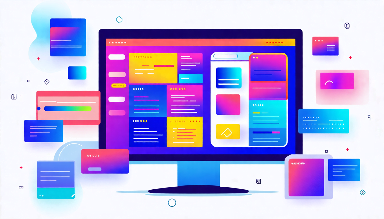
Grid: The Layout Swiss Army Knife
If Flexbox is a magic wand, Grid is the entire spell book. It’s like playing with LEGO bricks – you can create complex layouts with ease.
Think about designing a newspaper layout. With Grid, you can:
- Create columns and rows effortlessly
- Span elements across multiple grid cells
- Make responsive layouts that adapt to different screen sizes
It might seem intimidating at first, but once you get the hang of it, you’ll wonder how you ever lived without it.
Grid in Action:
Imagine you’re designing a photo gallery. With just a few lines of CSS Grid, you can create a perfect masonry layout that adjusts to any screen size. No JavaScript required. That’s the power of Grid.
Positioning: The Fine-Tuning Tool
Sometimes you need that pixel-perfect placement. That’s where positioning comes in. It’s like having a remote control for your elements.
- Relative: Moves an element relative to its normal position
- Absolute: Takes the element out of the normal flow and positions it relative to its nearest positioned ancestor
- Fixed: Locks an element in place, even when scrolling
- Sticky: Acts like relative positioning until the element reaches a specified threshold, then becomes fixed
Use positioning sparingly, though. It’s like hot sauce – a little goes a long way.
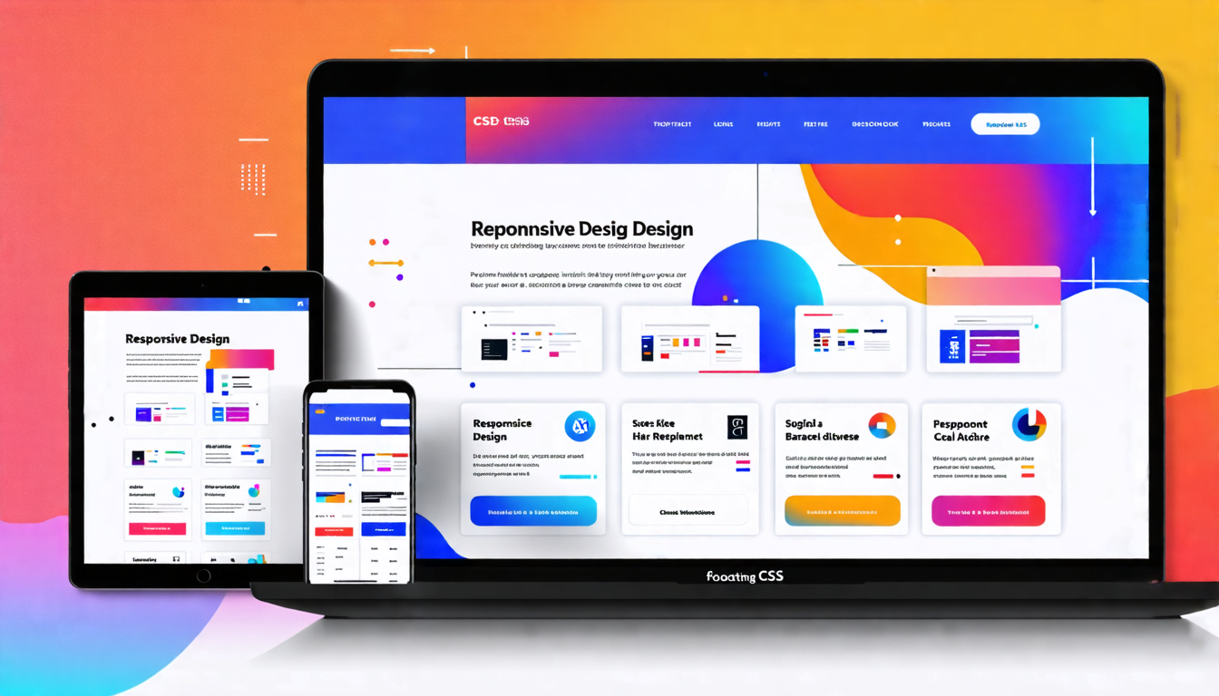
Responsive Design: One Size Doesn’t Fit All
Here’s the deal – your website needs to look good on everything from a smartwatch to a 4K monitor. That’s where responsive design comes in.
Media Queries: Your Responsive Best Friend
Media queries are like bouncers at a club, letting different styles in based on the device’s characteristics. They’re the key to creating layouts that adapt to any screen size.
For example:
@media (max-width: 600px) {
  /* Styles for small screens */
}
This tells the browser, Hey, if the screen is 600px or smaller, use these styles. It’s like having a shape-shifting website.
Wrapping Up: Practice Makes Perfect
Look, mastering CSS layouts is like learning to cook. You might burn a few dishes at first, but with practice, you’ll be whipping up Michelin-star worthy layouts in no time.
Remember, the best way to learn is by doing. So fire up that code editor and start experimenting. Before you know it, you’ll be the CSS layout guru your friends come to for advice.
And hey, if all else fails, there’s always pizza and Stack Overflow, right?